It’s a little hypocritical IMHO to ding Biden for his age when you consider that almost half the candidates running (7 out of 16) would be older than Ronald Reagan when they started. This view from last time is interesting because it really highlights how. damn. old. everyone is!
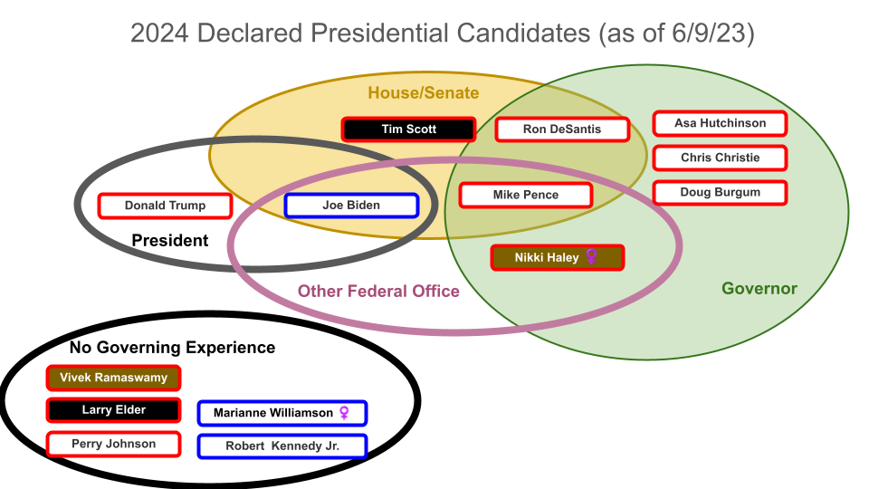
Revisiting a visualization on governing experience I did for the last election. The clown car is not nearly as full as it was the last time in June but still plenty of folks to keep track of.
Overall, Avatar: The Way of Water was a solid movie, worth a see and definitely worth a trip to the theater.
As befits its heritage, it was stunning visually. It had a look different from the original but you still believed that it was based on the same planet, good bit of world building.
The quality of the 3D experience was much improved from back in the day. I recommend springing for the 4DX experience if your local theater supports it. Moving seats, sprinkling water, shooting air and scents makes it a blend of move and amusement park ride. We paid a premium, but this movie made good use of its capabilities.
2 tips for 4DX:
As this movie had a lot of action, the fans were blowing air at you all the time making a cold theater even colder – bring a jacket!
The seats move around a fair bit and it’s really easy to end up with your food in your lap, even if you are holding it in your hands the whole time. I am a little surprised there wasn’t more of a disclaimer from the theater to be careful but I guess they make more money off of the food than it costs them to clean up afterwards
The plot was fine, if not well worn – this is territory that several movies have covered including the original (more on that later). The cast grew – they introduced 5 new main characters and did a reasonable job giving us enough visual and personality cues to tell them apart. Whether enough was done for us to actually care about all of them is a different matter. Part of what helped tho, is that the movie is looong, clocking in at over 3 hours.
Before I get into more nitpicky plot stuff… I will start out with an obligatory spoiler alert warning if you haven’t yet seen the movie…
By now, you are likely aware that Donald Trump, in a move that brings a new dignity to the man and will cement his place in history as a serious leader, made a “big announcement” that he sold a series of not-cringy “digital trading cards.”
The official site states there were 45 thousand cards for sale and showcases about a dozen of them. Curious as to what 45K images of Donald Trump would do to my brain, I took a look at the NFT resale marketplace OpenSea.io. The first thing you notice is that while there were 45K cards sold, in order to create scarcity there are definitely not 45K unique cards available (even tho, as we’ll see later, there could be). Secondly, the quality of these really was as bad as was reported – “lazy Photoshop of stock images” and “haphazardly edited” was very aproppo. This whole production essentially breaks down to a modern day version of paper dolls. All Trump had to do was contribute a handful of head shots and photoshop did the rest.
Plain old “vanilla” paper dollI was really into the Mighty Men and Monster Maker when I was a kidMy daughter was really into Gacha Studio a few years backMagnetic doll dress up set that my brother got me a few years backPaper dolls through the ages, a sampling of some that I have played with…
I am sure that the plummeting price of these is clearly a blip and these will assume their place in the pantheon of truly valuable collector’s items and good long term investment. As such, to help you find the Trump card that reflects your favorite incarnation of our former dear leader, I have prepared an overview of what is available. In 4 easy steps, presenting…
Like 61% of Americans, I was appalled at the massive curtailment of abortion rights that the Supreme Court recently handed down with the reversal on Roe vs. Wade and went to the capitol to protest. The turnout was impressive and the passion was palpable. However, the rhetorical fire was counterbalanced with some just god-awful grammar. The speeches were bad, but the signs were worse. They were all grammatically deficient – confusing at best, almost always had multiple contradictory meanings and at worst, made no sense at all. A sampling of the biggest offenders follows…
Keep your rosaries off my ovaries The grammatically correct way to say this is “Keep your rosaries off of my ovaries.”
Hot people are pro choice Looking at that crowd, this one was an obvious lie as there wasn’t a single good looking person around. Unless they were being literal, in which case it was 100% accurate as it was pushing 100 degrees in the shade.
Fuck the patriarchy Is this a command to have sex with the patriarchy or a request for the patriarchy to fuck off?
stop fucking republicans My favorite sign of all… a complete lack of capitalization and punctuation combined with the power of the English language and the amazing flexibility of the word “fuck” leads to the most incomprehensible sign there. There are 4 separate (very different) ways to interpret this…
Fuck as a verb, a command for everyone to stop having sex with republicans (you can fuck anyone else tho)
Fuck as an adjective, a command to stop just the republicans who fuck (but the republicans who don’t fuck are ok)
Fucking republicans as a noun phrase, a command to stop just the republicans who fuck other republicans (but the republicans who fuck others are ok)
Or if you just don’t like republicans, it’s a general statement to stop them all (tho “stop the fucking republicans” would have been clearer, IMHO)
The addition of a comma is another way to change the meaning entirely… stop fucking, republicans
This is a nicer request to the republicans to stop fornicating (but everyone else is still free to fuck)
The addition of a period, completely changes this again… stop. fucking republicans becomes…
a request to stop followed by an observation of more than one copulating republican
a request to stop followed by an observation of disgust regarding of a group of republicans
Look, all I’m saying is that if you can’t trust 60’s era Batman, who can you trust… good grammar is essential!
Hans and Franz, like much of what is on SNL is so so much worse than you remembered at the time. What I remembered as classic skits with a hilarious pair of characters is really just really dumb upon recent review. You can access all of them on NBC’s website to judge for yourself.
6. Prince Hans – Frozen
Number 6 on this list, but number 1 on the list of “twist villains named Hans.”
5. Hans Blix – Team America, World Police
While brilliantly played as the dry dry dry UN bureaucrat he dropped a spot given he is based on a real person and therefore has the worst claim to fictionality of anyone on this list.
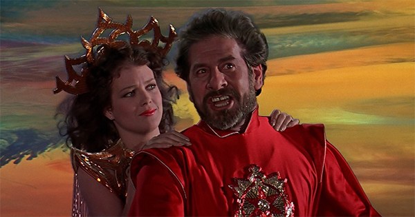
4. Hans Zarkov – Flash Gordon
Hans Zarkov is the perfect mad scientist and the best one of the group of heros in that movie. The titular Flash is super generic. Timothy Dalton as Prince Barin is boring and the leader of the Hawkmen Prince Vultan while hilarious, was a little too over the top.
Notable mention, he is also number 2 on the list of “Hans with goatees”
3. Hans Gruber – Die Hard
Hans Gruber rounds out the perfect ensemble that is Die Hard. He is the quintessential greasy European that we all immediately hate. He is menacing and is smart and stays ahead of the cops the entire time. The perfect villain.
Notable mention, he is number 1 on the list of “Hans with goatees”
2. Hans Moleman – The Simpsons
Often played as the butt of the joke, he was a bit character brought out as the most pitiful person on the receiving end of some horrible situation. Comedy gold.
1. Han Solo – Star Wars
While technically not a “Hans,” he is singular “Han” – which makes a good fit for number one! And to be clear, we are talking about the 1977 scoundrel who was not afraid to kill another miscreant in cold blood. Han shot first, end of story.
EMPTY flight, airborne. Leaving the northern coast of Spain, entering the Bay of Biscay.
Was doing a little digital cleanup and came across some pics from our trip to Spain and Portugal (judging from the age of the child, the absence of her brother and how much hair was still on my head, this was some time back). We were on a TAP (Air Portugal) flight that had one of the most circuitous routings – Lisbon to Houston… through Moscow. This wasn’t some hacker fare of different flights cobbled together, this was TAP’s main flight to get passengers across the Atlantic (via the Arctic!).
I’m taking my third break from the news in as many months.
The first was in March, the news was 24×7 COVID COVID COVID and yet we still knew nothing… all the stats were contradictory, our learnings evolving and any real test/vaccine/development was months off – nothing advanced my understanding of anything. Nothing really mattered. So I stopped watching.
In late April, I got in the car for a grocery run and turned on the radio… it was the 24th and literally the first news that I had heard in a month was Trump telling us that he thinks we should inject bleach to kill the Corona virus. I turned off the radio, confident in my decision to withdraw from the news. Nothing still mattered.
The past couple of weeks have not afforded such luxury of ignorance. However, the level of craziness and tragedy had become too much to take so I went searching for a brief respite and happened upon the 1977 video for Stayin’ Alive by the Bee Gees: Continue reading →
The field for the next debate this Thursday on Sept 12th is baked. Following is my original prediction with the actual results color coded – names in green made the next debates, red did not, red strikethrough didn’t make the cut and dropped out of the running.
Folks who will move on to the next round and totally deserve it (i.e. no duh)
Bernie Sanders, Elizabeth Warren, Joe Biden, Julian Castro, Kamala Harris, Marianne Williamson
Folks that will move on but really don’t need to be there (i.e. wasted spot)
Andrew Yang, Cory Booker
Folks that deserve to move on but probably won’t (i.e. damn shame)
Amy Klobuchar, John Hickenlooper, John Delaney, Steve Bullock, Michael Bennet
Folks on the cusp (i.e. hmmmmm)
Pete Buttigieg, Jay Inslee, Tim Ryan, Kirsten Gillibrand
Folks who won’t make it, and who won’t be missed (i.e. good riddance!)
Bill de Blasio, Beto O’Rourke, Tulsi Gabbard
Frankly, I am pretty surprised this thing largely went the way I thought it would. The biggest surprised to me is that Beto made the cut. And while I am surprised that Marianne Williamson didn’t make it, I am also a little heartened. Seeing sanity prevail and logically cutting people with no prior governing experience and crackpot ideas is wonderful. She added to the conversation, so glad she was there, but it is her time.
There are 3 other intrepid souls running not listed above. Joe Sestak and Tom Steyer took advantage of everyone being distracted by summer vacations to do a stealth entrance to the race. Because that is the best way to run a presidential campaign, on stealth. The third, of course, is my man Wayne Messam. I think at this point he is investing nothing in the race so there is really no cost to staying in or dropping out.